Whether you're communicating with employees, welcoming visitors, or promoting upcoming events, digital signage has one job: capture your audience’s attention.
That's easier said than done. Today’s audiences have multiple things competing for their attention at each moment of the day. A beautifully designed display means little if viewers can't understand the message in just a few seconds.
The most effective digital signage isn't necessarily the flashiest. It's clear, purposeful, and designed with the audience in mind. Strong layouts, readable typography, compelling visuals, and concise messaging are more effective at communicating information promptly.
The good news is that creating professional-quality digital signage no longer requires advanced design skills or expensive software. Platforms like Canva have made design accessible to everyone, offering intuitive tools and professionally designed templates that help organizations create polished, on-brand content.
The new Canva Integration for Poppulo streamlines this process even further. Teams can now move from design to published digital signage without exporting files or juggling complex workflows.
In this guide, you'll learn eight proven digital signage design best practices that will help your content stand out, engage viewers, and deliver better results—whether you're creating your first screen or managing an enterprise-wide digital signage network.
TL;DR: Digital Signage Design Best Practices at a Glance
Want the highlights before diving into the details? Keep these eight digital signage design best practices in mind:
- Know who you're designing for
- Keep every message short and easy to scan
- Design for viewing from a distance
- Use visuals that reinforce your message
- Stay consistent with your brand
- Refresh content regularly
- Use motion intentionally, not excessively
- Measure performance and improve over time
The good news? You don't need to be a professional designer to create engaging digital signage. Canva makes it easy to build polished content, while the Poppulo Canva integration makes it easier than ever to get those designs onto your screens
Design in Canva. Publish Directly to Poppulo.
Creating great digital signage doesn’t have to include downloading design files and then re-uploading those same files into another platform.
With the new Canva integration for Poppulo, your existing design workflow becomes even more efficient. Teams can create content using one of the world's most popular graphic design platforms and publish it directly to their digital signage network in just a few clicks.
That means fewer steps, fewer opportunities for outdated content, and more time focused on creating communications that engage your target audience. Whether updating a menu board or sharing company news, it's easier than ever to keep your digital displays fresh, consistent, and on brand.
1. Know Your Audience
Every successful piece of digital signage starts with one question: Who is this for?
Employees walking through a manufacturing facility need different information than visitors entering a corporate headquarters. Understanding your audience helps determine what they need and what information you share. From there, you can plan out how you present it.
It’s important to consider the location of the display, how long viewers will have to read it, and what action you want them to take afterward. A screen in a busy lobby may only have a few seconds to communicate its message, while a waiting area gives audiences more time to absorb information.
Thankfully, creating audience-specific content doesn't have to mean starting from scratch every time. Canva's extensive template library makes it easy to customize layouts for different departments, locations, and campaigns while maintaining a consistent visual identity across your organization.
2. Keep Messages Short and Scannable
Digital signage is not a brochure. People rarely stop to read long paragraphs on a screen.
Instead, focus on communicating one primary message at a time. Strong headlines, concise supporting text, and a clear call to action are often all you need. If viewers must work to understand your content, they'll likely move on before finishing it.
Visual hierarchy also plays a critical role. Use larger, bold fonts for headlines and smaller fonts for supporting information to help users discern the most important messages. Leaving enough space between elements will guide the viewer's eye naturally across the screen.
One of Canva's greatest strengths is encouraging clean, balanced layouts through its professionally designed templates. Rather than overwhelming viewers with too much information, these templates can help you narrow down the content that matters most.
Remember: If someone can understand your message in five seconds (or less), you're probably on the right track.
3. Design for Distance
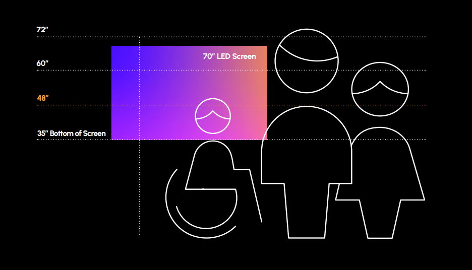
One of the biggest mistakes organizations make is designing digital signage while sitting inches away from a computer monitor.
Your audience won't experience the content that way.
Whether your display hangs in a hallway, lobby, or cafeteria, viewers often read signage from several feet away. Sometimes, they just walk past. That means every design decision should prioritize readability.
Choose large, legible fonts with strong contrast against the background. Avoid decorative typefaces for important information, and avoid overcrowding the screen with too many elements. White space is not wasted space; it helps viewers quickly identify the most important information.
When designing different screen sizes and orientations, test your layouts whenever possible before publishing.
For additional guidance, download Poppulo’s "Digital Signage Design Best Practices" guide, which covers typography, spacing and accessibility considerations that improve readability across every display.
4. Use Strong Visuals That Support Your Message
Images are often the first thing people notice, but be careful to not have them overshadow your core message.
High-quality photography, simple icons, clean illustrations, and eye-catching video help capture attention while providing context. Authentic visuals that reflect your organization, employees, or community often create stronger connections than generic stock photography.
Avoid using images simply because they look attractive. Every visual should serve a purpose by helping viewers understand or remember your message more effectively. Otherwise, it can be seen as more clutter.
Canva makes this process significantly easier by providing access to millions of stock photos, illustrations, icons, and graphic elements directly within the design platform. Instead of searching multiple websites or managing separate asset libraries, creators can quickly find visuals that align with their content and brand. Some of these icons can be tweaked to fit your brand image as well.
When paired with concise messaging, strong imagery transforms digital signage from something people ignore into something they naturally notice.
Read our blog and "Master Digital Signage Design Principles" to elevate your content above the competition.
5. Maintain Brand Consistency
Your digital signage is an extension of your brand. Every screen should feel like it belongs to your organization, regardless of who created the content.
Consistent colors, fonts, logos, and messaging help build recognition and trust over time. Whether you're displaying employee communications, promotional campaigns, or visitor information, a cohesive visual identity makes your content appear more polished and professional. Even templates, when used repeatedly, can help users grow accustomed to what type of message they’re looking at.
Creating consistency can be challenging when multiple departments or team members contribute content. Without clear standards, screens can quickly become cluttered with mismatched colors, inconsistent typography, and competing design styles.
Canva helps solve this challenge through Brand Kits, reusable templates, and shared design assets. Teams can create content that stays true to brand guidelines without reinventing every design. Combined with Poppulo, those approved designs can move directly from creation to publication, making it easier to maintain a consistent experience across every display in your network.
6. Refresh Content Regularly
Even the best-designed digital signage loses impact if viewers see the same message every day.
Fresh content encourages repeat engagement and gives audiences a reason to look at your screens again. Updating displays regularly also demonstrates that your communications are current, relevant, and worth paying attention to.
Look for opportunities to rotate seasonal campaigns, get ahead on upcoming events, celebrate employee achievements, recognize milestones, or highlight important organizational updates. In some cases, encouraging and leveraging user-generated content can get audiences really excited about your brand, while lifting some of the creative burden from your team. Small, frequent changes often have a greater impact than occasional large overhauls.
Keeping content fresh doesn't have to create more work for your team. Canva makes it easy to duplicate and update existing designs, while Poppulo simplifies the publishing process. Together, they make ongoing content management faster, helping organizations keep their screens relevant without adding unnecessary complexity to the workflow.
7. Use Motion Thoughtfully
Animation can be an effective way to capture attention, but only when it serves your campaign.
Subtle transitions, gentle movement, and simple animations can naturally draw viewers' eyes to important information. Excessive motion, however, can distract from the message and overwhelm audiences, especially on screens viewed from a distance.
The goal is to support communication, not compete with it. Use animation to emphasize key announcements, reveal information in sequence, or create visual interest without making content difficult to read.
Canva offers a variety of easy-to-use animation tools that allow anyone to add professional-looking movement without advanced design experience. When paired with thoughtful content planning and strategic publishing through Poppulo, motion becomes another tool for improving engagement rather than simply adding visual effects.
When in doubt, remember that clarity should always take priority over creativity.
8. Measure, Learn, and Improve
The most successful digital signage strategies evolve.
Pay attention to which messages resonate with your audience, which campaigns generate engagement, and which content goes unnoticed. Gather feedback from staff, observe viewer behavior, and look for opportunities to test different layouts, visuals, or messaging styles.
Small adjustments can lead to significant improvements over time. A shorter headline, stronger image, or simplified layout may dramatically increase how quickly people understand your message.
Continuous improvement becomes much easier when your design and publishing workflow is already streamlined. Instead of spending valuable time exporting files or managing uploads, teams can focus on creating, testing, and refining content that delivers better results.
The easier it is to create and publish digital signage, the easier it becomes to build a communications strategy that grows more effective with every campaign.
Conclusion
Great digital signage isn't about expensive design software or professional designers. It's about following proven design principles consistently. Canva removes the barriers to creating beautiful content, while Poppulo removes the barriers to publishing it—helping organizations create better experiences for a variety of audience types. If you’re interested in learning more, connect with us, we’re here to help!
Frequently Asked Questions
What makes good digital signage content?
The best digital signage content focuses on one message at a time. Use concise headlines, readable typography, strong contrast, high-quality visuals, and a clear call to action. Content should be easy to understand within a few seconds, even when viewed from a distance.
How do you design digital signage that people actually notice?
Successful digital signage is designed for quick viewing. Keep layouts simple, use large fonts, create strong visual hierarchy, and choose imagery that reinforces your message. Motion can also help attract attention when used sparingly and intentionally.
Can I create professional digital signage without being a designer?
Absolutely. Modern design platforms like Canva provide professionally designed templates, graphics, and layouts that make it easy for anyone to create polished content. With the Poppulo Canva integration, you can also publish those designs directly to your digital signage network without complicated workflows.
How often should digital signage content be updated?
Content should be refreshed regularly to remain relevant and engaging. Update displays whenever you have new announcements, upcoming events, seasonal promotions, employee recognition, or other campaign objectives. Even small changes help encourage repeat engagement.
What size should digital signage graphics be?
Design digital signage to match the resolution and orientation of your displays. Using templates built for your screen dimensions helps ensure content appears sharp, readable, and visually balanced across every display.
Can I use Canva for digital signage content design?
Yes. Canva is an excellent platform for creating professional digital signage content thanks to its extensive template library, Brand Kits, stock imagery, and intuitive editing tools. With the Poppulo Canva integration, teams can design in Canva and publish directly to their digital signage network, eliminating manual export and upload steps while keeping content fresh and on brand.