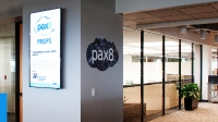
Nine Tips on Creating Effective Infographics for Employees
By
— June 10th, 2015

Did you know that an infographic is 30 times more likely to be read than a text-only article? The use of visual information has increased by 9,900% over the past 7 years because we’re hardwired to respond visually. Text alone just can’t compete.
As consumers we all access a world of information, much of which is interactive, bold and vibrant, conveying complex data but bringing it to life and making it digestible, appealing and even entertaining.
This is how our employees are choosing to consume their information. So it makes sense for us to replicate the approach by taking the information we present to our employees and making it inspiring and easy for them to absorb whilst also helping managers to cascade complex data.
Infographics (also known as data visualization) can be a powerful addition to your comms toolkit, however creating one is not a simple process and it’s important that you’re not just adding mediocre content to the information overload that’s already out there.
If like many organizations you’re using infographics as part of your internal comms tactics, here are some principal points to be considered for maximum impact:
- Start with the end in mind - Are you sharing top line financial updates? Communicating a business process? Providing survey feedback? Presenting information about new L&D opportunities? Celebrating successes? Directing employees to further sources of information? Keep in mind your ultimate goal and what you’re aiming to achieve.
- Tell a story, with a start, middle and end - Imaginatively weave a core theme through your graphic (both visual and written), rather than a random collection of data. Make your header bold and persuasive. Keep a logical distinction between thematic blocks and sections. Summarize at the end with a clear and compelling conclusion.
- Present your content in an easy to digest manner - If it’s hard work you’ll lose them. Keep it simple but not too simple. Make sure your data appeals to the eye’s natural pathway. Think as if you’re reading a series of headlines in a newspaper.
- Consistency is key – If you’re sharing information regularly in the same format, keep it consistent. Settle on your layout and stick to it, enabling employees to find what they’re looking for quickly and easily without constantly changing formats.
- Keep it simple – Many organizations use the traffic light system to make important information easy to identify. This is a well recognized approach – not reinventing the wheel, rather implementing good practice.
- Distil your data – Use infographics to catch employees’ attention with a condensed version of complex data. Present the headlines along with quick bites in the simplest possible way to avoid information overload. You could then signpost them to a supporting video that uses some of the same graphics to share the finer detail once they’re hooked.
- Mind your language - It's easy to overlook your terminology, but ask yourself, does it actually mean anything to your intended audience? A key pitfall to avoid is using highly technical jargon or complex financial terms that not every employee will immediately understand.
- Seek feedback - Remember – there’s a fine line between just enough and too much. Take a step back, ask others for feedback – use a cross section from your desired audience and prospective influencers who are willing to offer their thoughts. People love to give their opinion! Does it make sense? Is it information overload? If it’s likely to induce a migraine, strip it back and reassess.
- Consider seeking support - So, convinced by the stats you may decide to dive in and set about a DIY infographic. Whilst a quality visual may look simple to produce, it’s far from easy and can be time consuming. If you don't have an in-house designer who can take on the project, consider hiring one. The last thing you want is an infographic that looks unprofessional, messy and boring.
An effective example
We recently published our new report on creativity in internal communications, which centered round a survey delving into the levels of creativity in IC. We created the infographic below to share the headlines, replicating the style of the full report to maintain consistency. It’s a hugely effective way to present data creatively and capture the attention of your audience.
In summary
Infographics are vibrant, versatile and effective, enabling the ability to mix stats, visuals and anecdotes in one communication. By positioning infographic posters by lifts and staff areas, the content is visible and easily digestible for a diverse audience and for those less likely to access digital channels regularly. And with our brains processing visuals 60,000 times faster than text, they’re crucial as part of the mix in your IC toolkit.