First in our industry to be responsible AI certified
Learn more →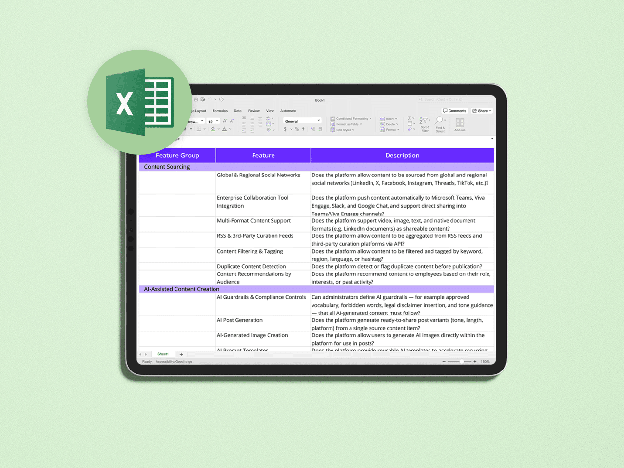
The Employee Advocacy RFP Template to Launch & Scale Your Program
A ready-to-use Excel template to help you evaluate employee advocacy platforms faster and make the right buying decision.

Access Whitepaper
About this Whitepaper
Choosing the right employee advocacy platform starts with asking the right questions.
This free, ready-to-use RFP template helps you structure your evaluation process, compare vendors consistently, and ensure no critical requirement is overlooked. Whether you're launching a new employee advocacy program or replacing an existing solution, this template gives you a proven framework to accelerate vendor selection.
Download the template to:
- Save hours of research and preparation
- Build a comprehensive employee advocacy RFP in minutes
- Evaluate vendors using consistent criteria
- Align internal stakeholders around the right requirements
- Make a confident, evidence-based buying decision
What's Inside?
The template includes:
- A complete employee advocacy RFP framework
- Hundreds of evaluation criteria covering all key platform capabilities
- A weighted scoring model to compare vendors objectively
- Guidance on how to customize the template to your organization's needs
- Best practices for running an efficient vendor selection process
Delivered as an editable Excel workbook, it's ready to use immediately.
Who Is This Template for?
This resource is designed for professionals involved in selecting an employee advocacy platform, including:
- Internal Communications leaders
- Marketing and Brand teams
- Employee Advocacy program managers
- Digital Workplace teams
- HR and Employer Branding professionals
- Procurement and IT stakeholders supporting the buying process
Why Download This Template?
Creating an RFP from scratch is time-consuming and often results in missing important evaluation criteria.
This template helps you focus on what really matters by providing a structured framework built around the capabilities modern employee advocacy platforms should offer. Instead of starting with a blank page, you can adapt the template to your specific needs and spend your time evaluating vendors—not building spreadsheets.
Join The Mailing List to get The Latest Resources
Related Content
The Internal Communications Measurement Masterclass & Playbook
Internal communicators measure plenty. Open rates, click-throughs, attendance, views, and reach—most IC teams have dashboards full of the stuff. What they struggle with is proving that any of it made a difference to the business. And business impact is the only measurement their leaders genuinely care about. It's a gap most IC practitioners feel acutely. Gallagher's 2026 Employee Communications Report found that seven in 10 internal communicators still measure only basic activity metrics, and fewer than one in eight measure business impact. Measurement is the weakest capability in their global readiness model, and teams relying only on activity data are the ones struggling most to demonstrate their value. This is a two-part guide built to close that gap. Part One is the Masterclass. It sets out why outcome measurement matters, the frameworks that make it manageable, and the principles separating measurement that proves impact from measurement that just fills a dashboard. Part Two is the Playbook. It's the templates, the worked example, and the sample dashboard—the practical tools you'll need for a successful comms campaign. Read the Masterclass for the thinking. The Playbook is where you'll find the tools to put it into practice. We hope you find them useful. Tim Vaughan Editorial Director, Poppulo
The Internal Communications Measurement Masterclass & Playbook—Part Two: The Playbook
Many IC teams measure and report on what's easy to count: email open rates, video views, all-hands attendances. Outputs that leadership don’t much care about. They want to know whether communications actually changed anything—whether people understood something important and whether behavior looked different afterward. Leaders want proof of impact, they want to see results. Outputs don't give them that. Outcomes do. Part One of this paper, the Measurement Masterclass, clearly showed why. Here, Part Two gives you the tools to measure outcomes: four templates you can fill in for your own campaigns, plus a full worked example showing all four completed together, so you can see how they fit before you use them yourself. What’s inside: The Know/Feel/Do Framework. Defines what a specific audience needs to know, feel, and do as a result of your communication—specific enough to measure. One template per audience segment. The Outcome/Output/Measurement Plan. For each outcome, sets out the communication tactic you'll use and how you'll measure whether it worked. This is the template you'll use most. The SMART Objectives Worksheet. A short exercise for turning a vague goal into a specific, measurable one, with a number and a deadline attached. The Power/Influence Grid. Maps your audience by power and attitude—champions, supporters, blockers, detractors—so you know where to put your effort. A worked example. All four templates completed end-to-end for a company-wide AI policy rollout, so you can see the whole process applied to one campaign from start to finish. A sample measurement dashboard. A one-page example of how to present outcome data to leadership. Written by Andrew Hubbard, Senior Director of Communications at Poppulo, and Joanna Hall of Afire Consulting.

Poppulo’s AI Jargon Buster
Lost in the AI Lingo? Here’s your cheat sheet to bots, buzzwords & brainy tech, made simple for internal comms pros.