
Planning Templates: How to Determine the Number and Placement of Digital Signs in Your Workplace

Access Guide
About this Guide
From meeting room signs and directories through wayfinding,
safety signs and more, digital signage is one of the most effective
ways to communicate with everyone in your workplace—regardless
of whether they are an employee or a visitor. But there are a lot of
things to consider prior to starting a new digital signage project.
Starting a new digital signage project can be overwhelming and involves a variety of considerations, from the number and location of screens to the purpose of those screens and the content they should display.
So, we’ve created this guide to give you guidelines around how many digital signage endpoints are needed for different zones, as well as a template to help you identify how many endpoints and additional communications channels your company needs.
The guide will help you:
- Identify your unique digital signage use cases
- Determine the number of endpoints needed in each zone
- Decide which additional comms channels are needed to reach all workers
Join The Mailing List to get The Latest Resources
Related Content
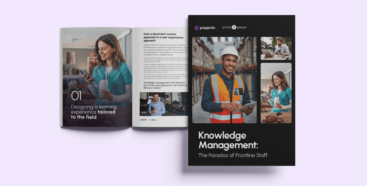
Knowledge Management: How Can You Better Connect Frontline Employees to Company Knowledge?
Knowledge exists everywhere in your organization. But can the people who need it most actually access it? For frontline employees, having the right information at the right time can make all the difference. Yet valuable knowledge is often scattered across tools, documents, and individual experiences, making it harder for employees to work independently, perform effectively, and share their expertise. How can organizations overcome these barriers? How can they make company knowledge more accessible to field employees while encouraging them to contribute their own insights and experience? In this white paper, Julhiet Sterwen and Poppulo bring together their expertise to explore a more accessible, collaborative, and engaging approach to knowledge management—one designed around the realities of frontline work. Drawing on best practices, real-world examples, and emerging opportunities powered by artificial intelligence, the guide offers practical insights into making knowledge work better for everyone. What's Inside the White Paper? Discover how to turn knowledge management into a real advantage for your frontline teams: The unique challenges facing frontline employees: Understand the barriers to accessing, sharing, and transferring knowledge. Making knowledge accessible and actionable: Ensure information is useful, easy to find, and available when it matters most. The role of communication and engagement: Encourage employees to access, share, and contribute to collective knowledge. The opportunities created by artificial intelligence: Simplify information discovery and help employees find the knowledge they need faster. Real-world examples and insights: See how organizations are bringing knowledge, communication, and employee experience closer together. Why Download This White Paper? Because knowledge that isn't shared is an opportunity missed. In organizations where teams are distributed, mobile, and often disconnected from traditional workplace tools, rethinking knowledge management has become essential. This white paper looks beyond traditional, document-centric knowledge management to explore an approach built around how employees actually work, what they need, and how they contribute to organizational success. A practical and strategic guide to moving beyond simply storing knowledge—toward making it accessible, shareable, actionable, and valuable across your organization. Who Is This White Paper For? This white paper is designed for leaders and teams looking to better support field employees and unlock the value of knowledge across their organization: HR leaders and learning and development professionals Internal communications and employee engagement teams Knowledge management and digital transformation leaders Operations leaders and frontline managers Employee experience and digital workplace teams
The Internal Communications Measurement Masterclass & Playbook
Internal communicators measure plenty. Open rates, click-throughs, attendance, views, and reach—most IC teams have dashboards full of the stuff. What they struggle with is proving that any of it made a difference to the business. And business impact is the only measurement their leaders genuinely care about. It's a gap most IC practitioners feel acutely. Gallagher's 2026 Employee Communications Report found that seven in 10 internal communicators still measure only basic activity metrics, and fewer than one in eight measure business impact. Measurement is the weakest capability in their global readiness model, and teams relying only on activity data are the ones struggling most to demonstrate their value. This is a two-part guide built to close that gap. Part One is the Masterclass. It sets out why outcome measurement matters, the frameworks that make it manageable, and the principles separating measurement that proves impact from measurement that just fills a dashboard. Part Two is the Playbook. It's the templates, the worked example, and the sample dashboard—the practical tools you'll need for a successful comms campaign. Read the Masterclass for the thinking. The Playbook is where you'll find the tools to put it into practice. We hope you find them useful. Tim Vaughan Editorial Director, Poppulo
The Internal Communications Measurement Masterclass & Playbook—Part Two: The Playbook
Many IC teams measure and report on what's easy to count: email open rates, video views, all-hands attendances. Outputs that leadership don’t much care about. They want to know whether communications actually changed anything—whether people understood something important and whether behavior looked different afterward. Leaders want proof of impact, they want to see results. Outputs don't give them that. Outcomes do. Part One of this paper, the Measurement Masterclass, clearly showed why. Here, Part Two gives you the tools to measure outcomes: four templates you can fill in for your own campaigns, plus a full worked example showing all four completed together, so you can see how they fit before you use them yourself. What’s inside: The Know/Feel/Do Framework. Defines what a specific audience needs to know, feel, and do as a result of your communication—specific enough to measure. One template per audience segment. The Outcome/Output/Measurement Plan. For each outcome, sets out the communication tactic you'll use and how you'll measure whether it worked. This is the template you'll use most. The SMART Objectives Worksheet. A short exercise for turning a vague goal into a specific, measurable one, with a number and a deadline attached. The Power/Influence Grid. Maps your audience by power and attitude—champions, supporters, blockers, detractors—so you know where to put your effort. A worked example. All four templates completed end-to-end for a company-wide AI policy rollout, so you can see the whole process applied to one campaign from start to finish. A sample measurement dashboard. A one-page example of how to present outcome data to leadership. Written by Andrew Hubbard, Senior Director of Communications at Poppulo, and Joanna Hall of Afire Consulting.